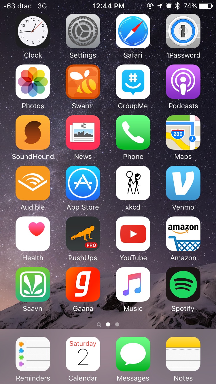
I read M.G. Siegler's post on his home screen and I thought it was an interesting way to analyze products and extrapolate trends over time. So here is mine:

I use a few rough metrics to determine if something goes on the home screen:
- frequency factor (how frequently I use it)
- immediacty factor (how immediately I usually need it)
- aspirational factor (how much I wish I used it)
Messages and Notes have high scores in frequency and immediacy. For example, if I need to write something down, I need the Notes app to be available fairly quickly, so I don't forget or take too much time away from the conversation/event that produced the note that needed writing down.
Swarm1 and Soundhound have really high score in immediacy, but lower scores in frequency, so they makes the home screen, but not the home row.
News and Health are both apps with high aspirational factors, because I want to get in the habit of looking at them more. Podcasts is an example of an app that was aspirational last year, but over months of it staring at me in the face, it now has a high score in frequency.
There are some stale apps here as well:
- GroupMe is going away now that my family uses iMessage for our group chat.
- Gaana will go away after my subscription ends this year; I've settled on Saavn as the superior app. Either Music or Spotify will probably go away also.
- xkcd inspired me to build daily habits, but I don't read it as often now, so it will probably go away.
You'll notice that the Camera app is not on the home screen, even though it scores high on frequency, immediacy, and aspiration, but it's not on the home screen because it's readily available from the swipe-up menu. Apps like Mail, Facebook, and Twitter are also missing, because they're reverse aspirational; i.e. I want to use them less.
Footnotes
- Now that I know about Pilgrim, Swarm might fall out of the home page because maybe I don't need to check in everywhere to build this map.
